The new Fossil app is a mess
Fossil just released the new v5.0 version of its app for hybrid watches.
Alas it's a complete mess and many functions are gone.
New layout wastes much place for advertisement
 |
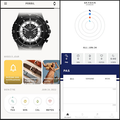
| New homepage style (Fossil) / old homepage style (Skagen) |
In the previous app, the main page displayed directly your health metrics in a single glance and you could get details quickly.
The new version shows your active watch image with the right watch style and watchface, wich is nice but rather useless.
About 1/3 of the screen real estate is used to display advertisement for accessories, watches, Fossil's Instagram ...
And then the last third of the screen is used to show your metrics ... but without synthetic view and you have to scroll right to see your sleep score.
Watchface design options are now very limited
 |
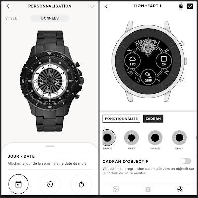
| New complications options / old options |
Complications doesn't have a background anymore, you just have icons and text in black or white on a transparent background without a circle. Completion circle is gone too. you cannot have a black or white background for complications anymore, nor choose between different circle style anymore.
This is clearly a huge step backwards, because it was extremely convenient to use an opaque background for complications which appeared and disappeared with the complication, using the long press on the top button.
Picture size in 240x240 doesn't work anymore you have to use a bigger size and won't get pixel perfect rendering.
Complication allignement is even more difficult than before, thanks to the much smaller preview of the watchface.
Watchface sharing is gone
You cannot share a watchface anymore through a Fossil link anymore.
Commute function is gone
I don't know if a lot of people used it, I didn't but it's not available anymore.
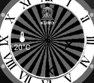
Weather complication is replaced by current temperature
So you don't have an idea of the type of weather anymore, just the temperature. Why removing such a usefull feature ? Was it so expensive for Fossil to pay the fees of a proper weather service ?
What a downgrade !
This much awaited version of the app is a huge disappointment to me. Instead of polishing the user experience they clearly degraded it to insert advertisement and removed many things that worked and were usefull.
