Inkpad Color mini review : the colored dream is still far away
Pocketbook inkpad color mini review
The old dream of color e-ink is still far away
> NEW ! PocketBook Inkpad Color 3 VS Kobo Libra Colour review
It’s not the first attempt
Color e-ink is an old fantasy at the scale of consumer technology evolution. Many people who love e-ink dream of colors. These dreams have already been disappointed some years ago with the introduction of Triton technology used in the failed Jetbook color e-reader. It was bad, really bad, with extremely dull and brownish colors and low contrast. Actually color was not so bad ... only if you had bright a spotlight oriented directly towards the screen.
There are 3 color e-ink tech
Years have passed and e-ink quest for color continued, giving birth to Spectra, ACeP and Kaleido technologies.
- Spectra is already available for price tags in some stores, you may have seen those price labels with black, white and red color. There is just one extra color, usually red or yellow.
- ACeP is not so common, it give beautifull and saturated colors but is expensive and extremely slow to refresh, making it unfit for e-readers.
- Kaleido is the new tech from e-ink and is based on a tradditional black and white pannel placed underneath a color filter array (CFA). This is the technology used in the new color e-readers.
Kaleido 1 wasn’t good enough
The first devices using Kaleido were released in the middle of 2020 but were not widely available. Now, the second generation is coming at a larger scale : Kaleido Plus which is in fact simply Kaleido 2 with a new name.
Kaleido 1 devices like the Pocketbook Color and the Onyx Boox Poke 2 color acquired quickly a quite bad reputation : dull colors, dark and dirty white, low definition.
Kaleido 2 is the new Kaleido Plus
Pocketbook just released the InkPad Color and I bought this device immediately.
It’s the same as the well known InkPad 3 but with a secon generation Kaleido Plus display. e-ink promised a huge improvement over the first generation with a new CFA and light system offering better whites, better details and more vivid color.
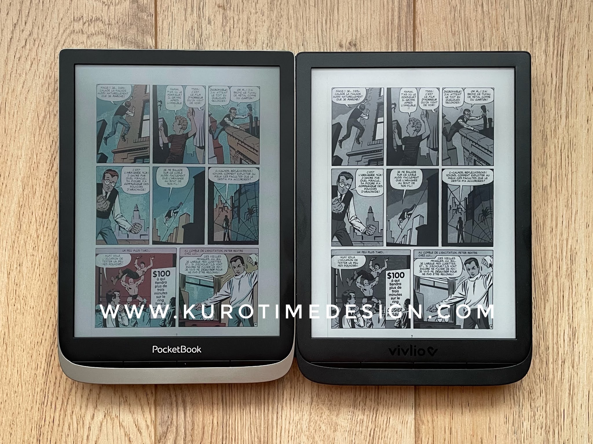
I didn’t see the first generation of Kaleido in person so I won’t try to compare and show the extent of the improvement but, as an e-reader user owning the Pocketbook inkpad 3 I can compare it to the color version.
Inkpad Color is the same as the inkpad 3 with a different display and frontlight
Everything is the same between those 2 devices, except for the e-ink panel and the frontlight system. So there is no need to review anything else as the device is well known and many review available on the internet.
The new display has huge drawbacks
Unfortunately the new color version may be not good enough, and far from it.
- The CFA is static and visible even on white giving a thin lines pattern that remembers me the old times of tube TV. Say good bye to the smooth and silky textures of your pages.

- The CFA filters the reflected light so much it makes the white significantly darker. Whites were always a bit grey with e-ink. This improved little by little over generations giving finally a quite beautifull very light grey. Now it’s more a medium grey and this looks like the very first generations of e-ink. Contrast is bad again.

- The CFA texture is visible everywhere and, even if the black and white stays at 300dpi, black text doesn’t look as detailed as before, disturbed by the filter.

- Color definition is low at 100dpi. That could be OK for illustration but comics quite often have colored text that becomes difficult to read.

- During years of slow evolution of e-readers, manufacturers have emphasized the eye comfort and included warm lights. On the best devices you can actually choose how warm your frontlight should be. The Pocketbook Inkpad color offers a very blueish light you won’t probably find comfortable to use at night.

- Its minimal level is extremely strong and definitively not suitable for night reading because it will probably induce eyestrain.

- Frontlight isn’t even, showing a bright line on the top.

- Colors are still muted and definitively not vibrant


All these facts let me think that Color is not ready yet for e-readers, and far from it.
Too many sacrifices for a very minimal advantage
Using such a device means sacrificing practically everything e-readers can offer ... for the sake of quite dull colors :
- Adaptative light with warm color and low level
- High definition and crisp text
- Beautifully smooth pages
- Quite good contrast
In conlusion : this is not good enough, alas !
Alas, this is a quite simple math and balancing advantages and drawbacks of the new version finally make obvious that it is a huge step back and I’m not sure many people will be happy with it.