EDIT : It seems Libra Colour display quality is extremely inconsistent from one device to another. If my first one was clearly awfull, I got another one 6 monthes after and it is quite good. Check my post about this here :
Color e-ink is still relatively new in e-readers. Available devices use the Kaleido. I reviewed two Kaleido 2 devices 2 years ago, the PocketBook Inkpad Color and the Onyx Boox Nova Color. Both were very disappointing to me, displaying extremely bad quality color images as well as awfull black and white text.
My review of the Nova Color
My review of the Inkpad Color
Whites were grey, with very visible horizontal lines, light system was very blue without any warm option, colors were extremely dull, to the point of being essentially grey with just a touch of color. The only favorable condition to use it was outside under a bright sun.
But some time has passed and e-ink released in 2023 the new Kaleido 3 tech promising more saturation, more contrast and and a higher color resolution.
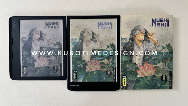
By the end of 2023 PocketBook replaced its Inkpad Color 2 by a Kaleido 3 Inkpad Color 3. And now Kobo has just released 2 Kaleido 3 devices, the very first attempts at color for them, the Clara color and the Libra Color.
I purchased an Inkpad Colour 3 about 1 week ago and a Libra color yesterday. I was quite happily surprized by the Inkpad and so, as the brand usually doesn’t shine in terms of display quality and UI refinement, I was expecting a better device with the Kobo Libra Colour.
Alas, after some hours of usage, I have to tell you that the Libra Color is clearly an inferior device. Its display is a complete disappointment, colors are extremely dull, light system is too pink-ish and worse, it makes the blacks washed out reducing an already suboptimal contrast. The Kobo does have some advantages but if you buy a color device you expect at least an acceptable color display and Kobo‘s first take on color is far from that.
1/ Black and White reading
Color implies sacrifices
It is very important to understand that to offer color, Kaleido tech makes quite strong sacrifices on black and white rendering.
- Whites are very dark, worse than a 15 years old e-ink panel
- Display shows a texture made of very fine lines which are diagonal and more discrete on Kaleido 3
- These lines can give a strange color glitter to the white depending on your eyes and your reading distance
- To compensate for the darker panel you will have to use the integrated light most of the time and at a higher level than with black and white panels.
- Using more the integrated light will use more power and decrease the battery life.
- Depending on its quality, the integrated light may wash out the blacks and make contrast worse.
All of this depends on the Kaleido 3 tech and appart from the light system quality no manufacturer can do better with this tech.
You will need to use the integrated light
So how is text reading ? Bad without integrated light (except under bright sun), good with it. Text seems a bit less contrasted on the Kobo once the light is ON. There is a fine texture visible on the white background on both devices but it’s not very annoying, you don’t see it much. For some people it makes a strange glittering color effect on the white backgroud. I didn’t notice that for my part.


Be aware that color text will not be as good, because color resolution is not 300 dpi but actually 150 dpi and text will look much more fuzzy. And you will clearly see the diagonal lines on color.
> If you plan to read mainly black and white content you should probably not get a color device in the curent state of tech. The sacrifices are too heavy.
2/ Manga and comics reading
Colors are dull but signifcantly worse on the Kobo
Color on e-ink is still extremely limited. These Kaleido 3 displays can only show very muted colors, and not a lot of variations. e-ink company claims they can display 4096 different colors which may be technically or theoritically true but is not effective in real life because of the very very small color space available showing only muted colors. I don’t even think you could see 256 different colors on these devices. Maybe something like 64 colors would be more realistic. Aaaah marketing bullshit !

Colors are completely inaccurate
There is no possible accuracy at all. Colors are very, very inaccurate. You are happy to recognise basic colors like … this is green, this is blue, this is red … or maybe brown ? Don’t hope to see subtle shades of a purple-ish blue or an emerald green … or a bright orange … or a bright yellow … accuracy is out of question and probably for a very long time.

| iPad is color calibrated (sorry for the lines on the Inkpad it’s a photography issue only) |
Kobo integrated light messes the colors even more
Changing the integrated light color to warm tends to decrease even further color saturation and make the colors even more inaccurate. With the Kobo light system, warm light is pink-ish and you never get a proper neutral yellow-ish tone for indoor evening use. Most of the time it will be too pink or too blue. Some yellow is missing. My Kobo Clara light is much better balanced. In comparison the Inkpad Color 3 light is much better balanced and looks more natural.

Kobo light system washes out dark tones
Worse is that as soon as the Libra Colour light is set just strong enough to compensate for the darker display, it begins to wash out dark tones and make it look vaguely luminescent, reducing the contrast. In comparison the Inkpad Color 3 light doesn’t wash out dark tones as long as you set it at the right level to compensate for the darker display. Which makes using the light on the Inkpad much much better.

Color rendering is much better on the Inkpad Color 3
Now that your expectations have been toned down to reality, I have to tell you that contrasts and colors can be a bit optimized to a certain extent to give a quite satisfying sense of color. That’s what PockedBook has done and colors are much more vibrant on the Inkpad Color 3. However, because of this color optimization, grey areas tend to show false colors and enhanced microcontrast can make subtle textures a bit harsher. That’s the drawback ! But don’t believe colors are more accurate on the Libra Color, it’s just completely dull.

 |
| Kobo has no color or contrast setting - PocketBook has settings to let you custom color rendering to your taste. All pictures in this review were shot at default settings. |
Size matters
Kobo Libra Colour has a 7" display, Inkpad Color 3 a 7,8" panel. This is approximatively the size of the Sage’s screen. At these sizes, 0,8" makes a huge difference and manga or comics reading is much more comfortable on the Inkpad. Of course you can use the convenient double tap to zoom on the Kobo but frankly this can be tedious if you have to do it for practically every text bubble on a comic. In comparison PocketBook pinch to zoom is atrociously slow, but you won’t need it as much.
There is no manga mode on the PocketBook
Come on PocketBook ! You sell color devices which are perfect for mangas … and your reader doesn’t support Right To Left reading ? How is this possible in 2024 ? Is there anybody in this company who actualy use your devices ? This is a shame !
There is no double page support on PocketBook
Bummer … this is a basic feature on most e-reader and is necessary for manga reading as double page layout is quite common. Shame again !
> If you plan to read manga or comics there is no debate, size and colors are much better on the Inkpad Color 3. The Kobo is so bad that you would have a better experience with the black & white Libra 2 than the Libra Color. But be aware that software wise the PocketBook is lacking a lot on basic functions which are needed for manga reading. None of these devices is very good for this use.
3/ Notes with stylus on the Kobo only
Kobo Libra colour can be used with a dedicated stylus to take notes. I didn’t buy the stylus and didn’t test the note function. However, if you are after a note taking device, an Onyx Boox e-ink tablet would probably be a better choice. But more expensive.
4/ Text to speech on the PocketBook only
Kobo doesn’t allow text to speech on its readers. They want to sell their audio books. Same for Amazon and its Kindles.
PocketBook has integrated a very good Text To Speech engine which will read aloud any text in a book. They offer around 30 languages and various voices in each language. French is very good, not perfect, some intonation are not natural, some words can sound strange from time to time, the engine doesn’t make a pause after a paragraph … but overall this is one of the best TTS solutions I have ever used for reading (in french), and I use it quite a lot. The integrated speaker is good enough for voice in a quite quiet place and you can connect any bluetooth speaker.
5/ UI and software
Better software on the Kobo
How the UI looks is a matter of taste. I really like better the Kobo beautifull UI which looks a bit like a magazine, it’s really a joy to use and it’s snappy, it’s focused on reading, nothing to complain about here. In comparison the PockeBook User Interface is efficient and simple but a bit bland design wise. Unfortunately and despite PocketBook claims their user interface is not so snappy. It’s perfectly useable, you don’t wait much to open a book or a menu but it’s not as satisfying.
Better hardware on the PocketBook
The Kobo Libra Colour is a well made device but feels very plastic, light and a bit cheap. There are 3 buttons which are responsive. The rounded design is quite nice and handy as well as the side handle. However the Inkpad Color 3 design, not as rounded, with more visual element looks more interesting and appealing to me - which is definitively subjective. It’s well made and doesn’t feel as cheap as the Libra Colour. It has 4 buttons which is more convenient. I like better the buttons under the screen rather than on the side. The protruding page turn buttons are well designed and comfortable to use.
6/ Privacy and freedom
Account necessary on the Kobo
When you start your Kobo you are forced to make an account and cannot use the device without it. There is a solution involving a computer to modify some files in the device to let you use it without account but it’s not official. PocketBook doesn’t force you to make an account at all. You just start the device. You will obviously need an account if you want to use their bookstore or their sync options but you can perfectly enjoy your device without it.
You cannot get rid of the Kobo bookstore
Bookstore is deeply integrated in the Kobo and you will not completely hide it or its suggestions. They sell you a device so they can sell you books after that. On the PocketBook you don’t need the bookstore at all, you don’t need to log in, you can remove the bookstore shortcut and will only see your books if you want. You can completely forget they have a bookstore and can sell you books !
7/ Conclusion
When I got my Libra Colour, one week after the Inkpad Color 3, I was very excited to try it. I really hoped it would be an even better device than the Inkpad which was already quite convincing to me.
The Libra Colour is a disappointing mess
Alas Kobo missed completely the point for their first color devices. They offer colors that look as dull as on the old Kaleido tech and a very bad light system. Given the huge sacrifices in contrast and clarity you have to make to get a color display, colors should be much better than the dull greys with just a hint of color Kobo offers. I would not recommend the Libra Colour to anybody. A black and white Libra 2 is a much better device. Even for manga.
The Inkpad Color 3 is a good device with a lacking software
Surprizingly, the pocketbook is a quite fine device, with nice colors that pops enough to be satisfying given the limits of the current technology. Its size is good for manga and small comics even if it’s still a bit small for full size comics. Unfortunately the software is relatively poor and lacks some basic functions which are needed for manga reading. It offers an excellent Text To Speech engine and is much more open than the Libra Colour. It’s not perfect but I can easilly recommend the Inkpad Color 3 to anybody who wants a color e-reader and is ready to use the integrated light to compensate for the darker display. It’s more expensive but size does matter and large e-ink panels are not cheap.


