Amazfit GTR 2 & 2e review part 3 : UI
Part 1 : HARDWARE
Part 2 : BATTERY LIFE
Part 3 : UI
Part 4 : WATCHFACES, CALLS, MUSIC
Part 5 : SMARTNESS, APPS, NOTIFICATIONS
Part 6 : HEALTH & SPORT
Part 7 : CONCLUSION
Part 2 : BATTERY LIFE
Part 3 : UI
Part 4 : WATCHFACES, CALLS, MUSIC
Part 5 : SMARTNESS, APPS, NOTIFICATIONS
Part 6 : HEALTH & SPORT
Part 7 : CONCLUSION
System and user interface : very good !
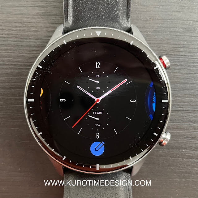
The user interface is simple and easy to use, not very original, nothing to talk home about but it’s still nice to see and convenient to use. Everything fits well in a round display and works fine with the touch screen. As the panel used is OLED, everything pops out of a black background to limit battery use.The main screen shows the watchface. Long press to choose the watchface or customize it (some let you choose the content of complications). This watch can keep quite a lot of different watchfaces stored onboard with no need to use the phone to send it again to the watch. In comparison a Fitbit Sense can only keep 5 watchfaces in memory ...
Swipe down to display a well designed shortcuts panel showing time, date, battery level, current weather with risk of rain and the phone’s connection status. Shortcuts are usefull:
- Torch mode
- Brightness
- Do Not Disturb
- Energy saving
- Watch lock
- Find phone
- Speaker volume (GTR 2 only)
- Theater mode
- Keep the watch awake for 20mn ( on a second panel you can get by swiping left)
Swipe up shows the notification list (more about it later)
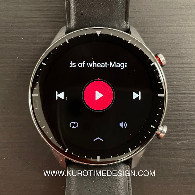
Swipe right displays a list of very clever user selected cards you can scroll up and down. These cards shows some shortcuts to usefull apps with a basic display of their data as well as apps running in backgroud. You can touch the cards to go to the full app. It’s very convenient to go back to a timer or a workout still runing after you just did something else on the watch. This is simple and efficient multitasking and it’s new on the GTR 2 and 2e. If you swipe right again, you get the widgets and the watchface again.
Swipe left shows the user selected widgets, maximum 5 will be displayed here and swiping again a 6th time will show the shortcuts and multitask card and swipe again to go to the watchface.
The user interface is quite smooth and pleasant to use. From time to time, quickly swiping through the screens does show a decrease of smoothness but nothing annoying at all and it stays a lot more consistent than a Wear OS watch, for example.
There are not too many levels in the menus, everything is quite straightforward except, curiously, for a strange « widget » folder in the apps list. It’s perfectly useless to hide some apps in this folder. You can remove apps you don’t use from the list and select their order for more convenience. Except for apps in the strange « Widget » folder. That’s not super annoying, it just doesn’t make sense.
GTR 2 and 2e have another very new and quite unique function : an offline voice assistant, only available in english. It’s a simple voice command allowing you to speak basic shortcuts to do things like set the volume or display brightness, show the watchface or launch an app. It’s really nice but ... not very usefull because you will still need your fingers to scroll trough the data fields. But at least you can use it to quickly launch a workout, pause or resume it.
The GTR 2 (not the 2e) is supposed to get an OTA update to add Amazon Alexa assistant in many languages ... later and there is no shedule about it. Let’s hope they will be more commited to keep their promises than Samsung who released the Active 2 with the promise of SPO2 measure ... function not yet available everywhere 1 year and a half later.


