Amazfit GTR 2 & 2e review part 5 : Smartness, apps, notifications
Part 1 : HARDWARE
Part 2 : BATTERY LIFE
Part 3 : UI
Part 4 : WATCHFACES, CALLS, MUSIC
Part 5 : SMARTNESS, APPS, NOTIFICATIONS
Part 6 : HEALTH & SPORT
Part 7 : CONCLUSION
The Amazfit GTR 2 and 2e are a sensible middle ground approach of the function/battery/efficiency question. It’s between an advanced sport band and a phone-like smartwatch. They don’t have all the functions you can find on an Apple or Samsung watch but they are focused on essential features to offer a more accessible device and an incredibly better battery life.
This is refreshing in a smartwatch world cluttered with useless functions.
- I don’t need to take a picture of my outfit to ge the watchface to match automagically with my clothes ... especially if it doesn’t even work most of the time.
- I don’t need to watch YouTube on my watch.
- Nor to browse internet on my tiny round screen, killing half of my battery life in 10 minutes.
- I don’t need to draw on my watch either, all I could do on a so small screen is a heart or maybe a dick ? Well, when I wanna send this kind of message (yes, it happens), taking my phone is easier.
- And what about the app launcher ? When all apps shows only as small icons like sardins in a tinbox and you don’t even remember what is what and you struggle to select the right one ... what a level of cumbersomeness !
Another problem with many smartwatches is that their functions can vary depending on the brand of your phone.
- Apple watches are reserved to iPhones, if you wanna change for an Android, you’re stuck.
- Samsung watches will have much more functions with a Samsung phone than any other Android ... but will work with iPhones, in a limited way (partly because Apple purposely limits other smartwatches access to your mails and text messages).
- Wear OS watches will work the same on most Android phones and be very limited on iPhones, like Samsung watches.
The Amazfit GTR 2 and 2e will strictly have the same functions on every phone, even on an iPhone.
The watch can display any notification from the smartphone but won’t let you choose so precisely what app can send it to the watch. In Zepp, only the main phone apps have a dedicated icon and switch for notifications, calls, text messages, mail, agenda, Twitter and some others like Facebook or Telegram are in the list. If the app is not already installed on the phone, it will not show in Zepp. Any other app go in the OTHER section with a generic APP icon and a unique switch for the entire OTHER section.
About the text ... hyphenation is not supported, the text will be cut at the end of the line and continue next line without hyphen and in the middle of a word. Thant’s not so important, but mildly disappointing when you think about the overall excellent quality of the watch.
Pictures won’t display so any MMS will just show saying IMAGE, like on Fitbit, Huawei or Garmin watches.
Another little usefull thing is missing : there is no indicator for unread notifications. That’s probably not a big deal to add this function.
You can touch it to open and read more. It will not show you an entire long mail (that’s not the purpose anyway) but will be perfect for text messages, even quite long ones, in the limit of 250 letters.
A long press on the card will allow you to erase the selected notification. Scrolling down to the list of cards will show a trash bin to quickly delete every cards. Notifications are shown by order, the most recent first, there is no grouping and a new text doesn’t delete a previous one, even from the same contact, so you can easilly read all the last messages, in the limit of 20 notifications.
Notifications are not perfect yet but already very convenient and convincing, this is a huge improvement from the previous GTR and is a lot better than on Huawei or Garmin watches.
Part 2 : BATTERY LIFE
Part 3 : UI
Part 4 : WATCHFACES, CALLS, MUSIC
Part 5 : SMARTNESS, APPS, NOTIFICATIONS
Part 6 : HEALTH & SPORT
Part 7 : CONCLUSION
Half smart ... Is maybe finally smarter
Let’s be clear : a smartwatch cannot replace a smartphone. Screen size, computing power, battery life and user interfaces are simply not ready for that. Some manufacturers have tried so hard to cram as many functions as possible in their tiny devices, hoping to make their product successfull and appealing for a wider audience, that most of these things became cumbersome and unusable. They managed to make their watches slow, unreliable and complicated to use. Or simply so battery hungry you have to charge it every day or every other day and keep an eye on the battery each time you actually use it.The Amazfit GTR 2 and 2e are a sensible middle ground approach of the function/battery/efficiency question. It’s between an advanced sport band and a phone-like smartwatch. They don’t have all the functions you can find on an Apple or Samsung watch but they are focused on essential features to offer a more accessible device and an incredibly better battery life.
This is refreshing in a smartwatch world cluttered with useless functions.
- I don’t need to take a picture of my outfit to ge the watchface to match automagically with my clothes ... especially if it doesn’t even work most of the time.
- I don’t need to watch YouTube on my watch.
- Nor to browse internet on my tiny round screen, killing half of my battery life in 10 minutes.
- I don’t need to draw on my watch either, all I could do on a so small screen is a heart or maybe a dick ? Well, when I wanna send this kind of message (yes, it happens), taking my phone is easier.
- And what about the app launcher ? When all apps shows only as small icons like sardins in a tinbox and you don’t even remember what is what and you struggle to select the right one ... what a level of cumbersomeness !
Another problem with many smartwatches is that their functions can vary depending on the brand of your phone.
- Apple watches are reserved to iPhones, if you wanna change for an Android, you’re stuck.
- Samsung watches will have much more functions with a Samsung phone than any other Android ... but will work with iPhones, in a limited way (partly because Apple purposely limits other smartwatches access to your mails and text messages).
- Wear OS watches will work the same on most Android phones and be very limited on iPhones, like Samsung watches.
The Amazfit GTR 2 and 2e will strictly have the same functions on every phone, even on an iPhone.
Apps : limited but most essential things are there
Unlike for the watchfaces, Amazfit doesn’t bother with an app store, you cannot add a new app and must do with what is already there.- Stress
- Température (GTR 2e only)
- Heart rate
- SPO2
- Activities
- Workout
- Activity goal
- PAI
- Music
- Weather
- Events
- Alarm
- Timer
- Count down
- Compass
- Barometric altimeter
- Find mobile
- Settings
- Agenda
- To do
- World clock
Notifications : quite good but still some work to do !
This is one of the main functions of a smartwatch : display notifications to avoid to extract your phone from a bag or a pocket whenever it vibrate and let you decide at a glance if it’s worth answering immediately. Notifications on the GTR 2 & 2e are quite good (really) but some work is still needed to make it perfect.The watch can display any notification from the smartphone but won’t let you choose so precisely what app can send it to the watch. In Zepp, only the main phone apps have a dedicated icon and switch for notifications, calls, text messages, mail, agenda, Twitter and some others like Facebook or Telegram are in the list. If the app is not already installed on the phone, it will not show in Zepp. Any other app go in the OTHER section with a generic APP icon and a unique switch for the entire OTHER section.
Fonts are too small
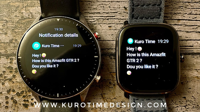
Let’s talk about font size ... This is definitively too small and without any reason because the screen is large. Of course, you can have a better overview of a long message but a larger font would be much more pleasant and easier to read. By chance, the OLED screen has an excellent contrast and, even if the text is as small as on a Fossil Hybrid HR, it’s much easier to read because the e-ink display of this hybrid has a very low contrast. But a cheaper and smaller watch like the GTS 2 mini can display larger (but shorter) and much more easy to read text.About the text ... hyphenation is not supported, the text will be cut at the end of the line and continue next line without hyphen and in the middle of a word. Thant’s not so important, but mildly disappointing when you think about the overall excellent quality of the watch.
Emojis, pics, indicator
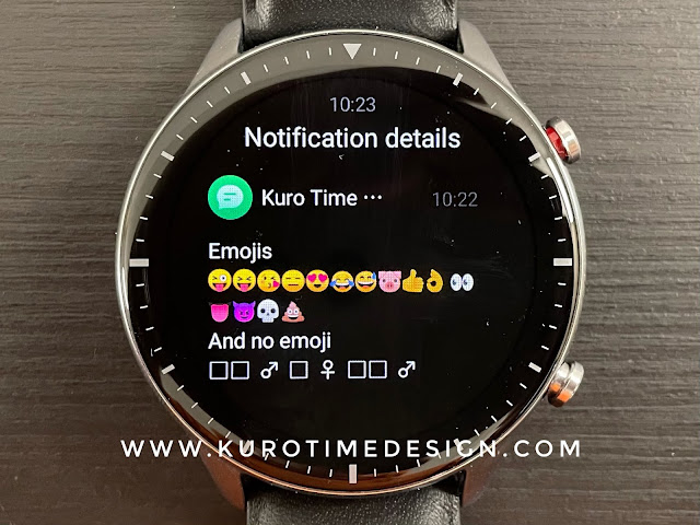
Emojis are there ! Natively, in colors, without tinkering like on the first GTR. Unfortunately, only the very basic emojis wil show on your watch. Any recently introduced emoji will be replaced by a small square. That’s not so important for everybody but emojis became a quick way of adding feeling and expressivity to texts and this lack of modernity is somewhat annoying.Pictures won’t display so any MMS will just show saying IMAGE, like on Fitbit, Huawei or Garmin watches.
Another little usefull thing is missing : there is no indicator for unread notifications. That’s probably not a big deal to add this function.
Half status mirroring
More annoying is the lack of notification status mirroring, at least on iPhone : if you read a notification on the watch it will not show as read on the phone. If you delete notifications on the watch, they won’t be deleted on the phone either and you will have to remove it on the phone too. But if you read or delete the notification on the phone, it will be deleted on the watch.Efficient and functionnal UI
Overall presentation is clear and functional. Swiping up on the watchface will show the notification panel where each item is displayed as a card with the icon of the app (only for the main apps) and the first words of the content.You can touch it to open and read more. It will not show you an entire long mail (that’s not the purpose anyway) but will be perfect for text messages, even quite long ones, in the limit of 250 letters.
A long press on the card will allow you to erase the selected notification. Scrolling down to the list of cards will show a trash bin to quickly delete every cards. Notifications are shown by order, the most recent first, there is no grouping and a new text doesn’t delete a previous one, even from the same contact, so you can easilly read all the last messages, in the limit of 20 notifications.
Notifications are not perfect yet but already very convenient and convincing, this is a huge improvement from the previous GTR and is a lot better than on Huawei or Garmin watches.


