Fenix 6 as a Fossil Hybrid HR alternative, part 4 : UI & BASIC FUNCTIONS
USER INTERFACE
✌Winner : Fenix 6
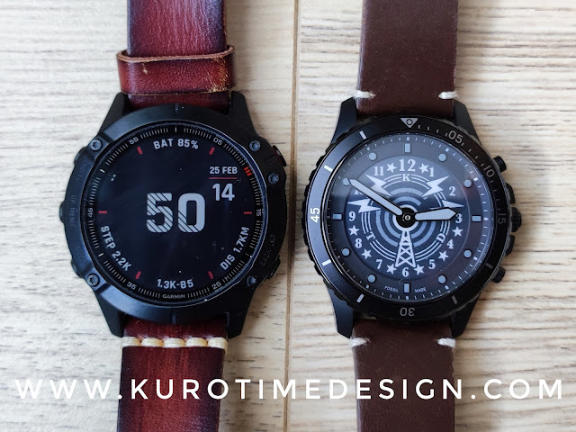
With a larger and much faster display and 64 colors, the overall user interface of the Fenix 6 is miles ahead. You have some (simple) animations, more information and a much better use of the screen real estate. Color helps to organise informations and add a nice touch to watchfaces.
However the Garmin OS is designed to run on very low power platforms and is not a really modern graphic OS. Everything is based on text, icons and 2D graphs, not on pictures. You can use a picture as a watchface background but it’s almost the only situation you will see a picture on the screen.
 |
| Shortcut launcher (left) & apps & activities menu (right) |
Everything is clear and detailed. Very functional and much more readable than on the Fossil Hybrid HR line.
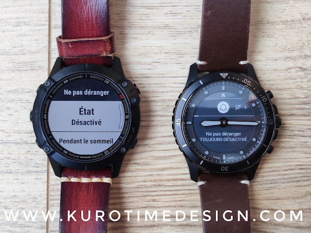 |
| Settings are easier to access and read on the Fenix 6 |
WIDGETS
✌Winner : Fenix 6
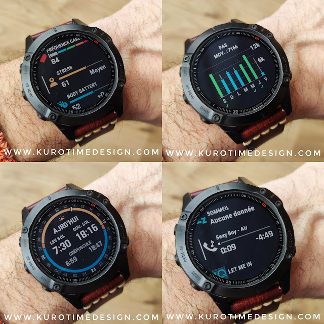
Push the UP or DOWN button and the widgets get displayed. Push again and you scroll to the next page and again untill you go back to the watchface. Simple, efficient, usefull. You choose what widget you want in a large list. You can even install more widgets from the app store.
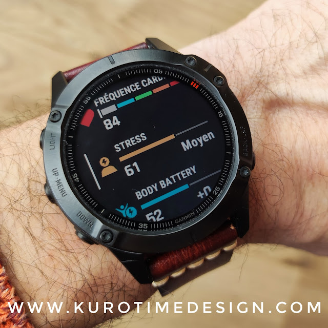 |
| 3 widgets at once, you scroll 3x less |
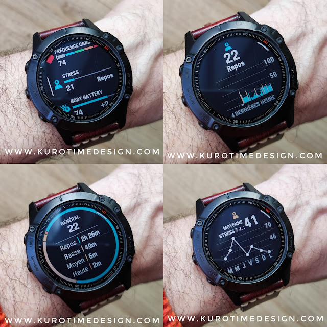
The new Quick Glance widget system introduced with the Fenix 6 is extremely well designed. When most smartwatches displays one widget at the time, using all the screen surface and asking you to scroll for a long time to reach the widget you want, Quick Glance displays 3 reasonably detailed widgets at the same time on one screen. Scrolling through 9 widgets or more is much faster this way. Each little widget can be selected and then displays full screen with more details, often on several screens.
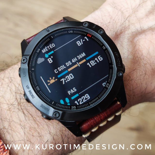 |
| Weather Quick Glance |
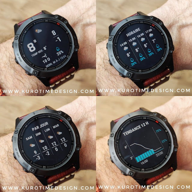 |
| Once a Quick Glance widget is selected, you can scroll through more details |
BUTTONS NAVIGATION
✌Winner : Fenix 6
Buttons are quite large, precise, clicky and reliable. With 5 buttons, navigation is much easier on the Fenix 6. With only 3 buttons, and not even as good as the Fenix buttons, the Fossil Hybrid HR is often quite cumbersome and tedious to use. The Fenix still uses short and long buttons press for specific functions but everything is easier an more convenient.
- The dedicated LIGHT button is incredibly better than the unreliable double tap to activate light on the Fossil Hybrid HR
- A long press on the light button launches a customizable round menu used to launch basic things like NFC payement, music, search my phone, timers …
- UP and DOWN buttons works perfectly to scroll through menus.
- A long press on UP shows you the parameters menu
- A long press on DOWN sends you to a user chosen function
- The red ENTER button is used to validate choices
- A long press on the ENTER button triggers the customizable app and activity launcher
- BACK button function is quite obvious, I guess
- A long press on BACK does nothing
WATCHFACES
✌Winner : Fenix 6
The Fenix 6 can store several different watchfaces (I have more than 15 stored on my watch) and you can change it without the phone, directly on the watch with some buttons clicks. Garmin included watchfaces can be customized directly on the watch with a nice range of options. There are some very nice designs here and Garmin’s designers certainly deserve our praise for that.
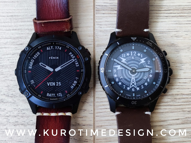 |
| 2 official watchfaces, Fossil Hybrid Hr with a custom watchface |
Garmin added the Face It option in the Connect IQ app on the phone. You can design quickly your own watchface with a background picture and watch hands or digital time. There are some options but choice is quite limited and, unfortunately, watch hands doesn’t use anti aliasing which make them look a bit ugly.
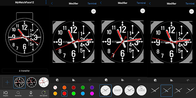 |
| Face It lets you make your own watchface with a picture of yours |
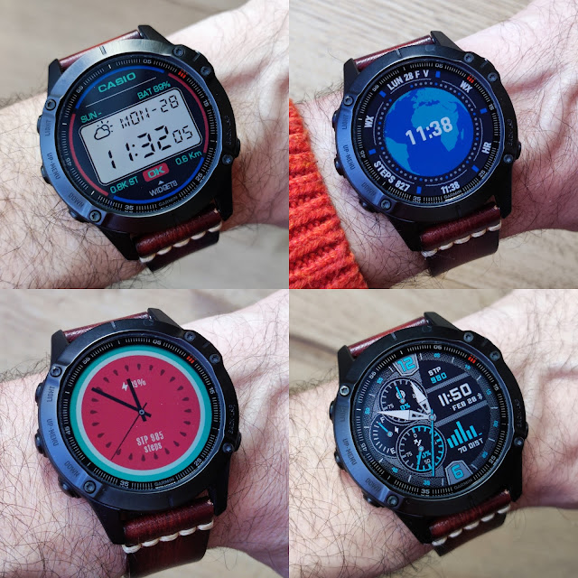 |
| Various free watchfaces styles from the Connect IQ store |
Watchfaces are specific apps. They can be analog or digital style, include as many complications as the designer wants and with the graphics the designer wants, including custom fonts. You can, for example get a complete LCD style inspired by an old Casio watch, with LCD digits fonts, which is impossible on a Fossil Hybrid HR
CALENDAR
This is a basic function, checking your next appointments on your watch is handy and makes sense, this is definitively not a useless gimmick. Alas Fossil didn’t include it in the feature set of the Hybrid HR. Here, you can have a widget for it. In the Quick Glance view, it will show your next appointment for the day. If you select the widget you will get the full list of your events for the day. Then you can select any event to see more details.
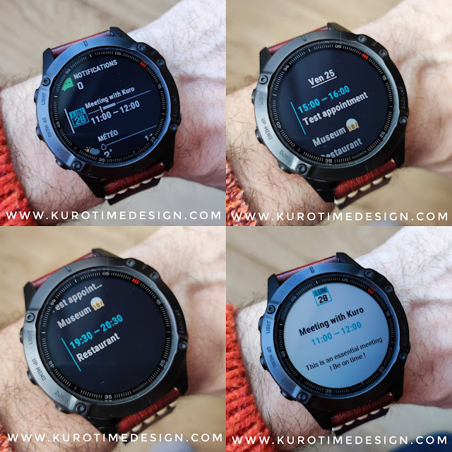 |
| Quick Glance calendar, list of events, details of an event |
APPS & ACTIVITIES
✌Winner : Fenix 6
There are many excellent reviews of the Fenix line as sportwatches on the web. I won’t speak much about it as this comparison is not sport focused. The Fenix 6 comes with a large choice of about 50 indoor and outdoor activities. It is waterproof down to 100m. You can choose what activities are usefull for you and will be displayed in the watch list. There are some apps already installed and you can download more apps from the Connect IQ store.
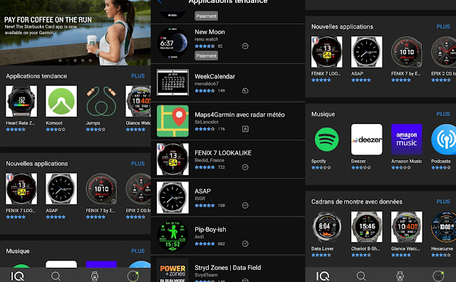 |
| Apps and watchfaces on the store |
With 10 X more activities and an app store the Garmin clearly is another watch. The Fossil Hybrid HR line is much more limited and you will have to use only the reduced feature set included. It is not waterproof at all, just splash proof which is not enough even for a shower, so you won’t fin any water based activity.
Garmin’s app store is quite limited in comparison with other platforms. You won’t find many games, no web browser, no video player and there is little bullshit like these utterly useless apps on a watch. We don’t need to browse interne on a watch, we don’t need an app to automatically change the watchface color according to our clothes … This app store is more FOCUSED on usefull things for a watch. Most apps are sport or activity or health oriented but you can find many other usefull things, like a widget to display your Covid pass or any other QR code, for example.
HEALTH
✌Winner : Fenix 6
I won’t speak too much about health tracking on the Fenix 6, as for the activity aspects, there are plenty of excellent reviews if you want in depth reviews of these functions.
The Fossil Hybrid HR health tracking is based on the HR monitor and the accelerometer only. This gives simple metrics which can be enough for casual uses. It’s used for sleep analysis too which is probably not enough data to get a significant sleep understanding but at least gives you an idea. All of this should be perfectly OK for most people.
Here again, the Fenix 6 is another beast. It’s based on much more advanced sensors, can track SPO2, Heart Rate variations, temperature … metrics are a lot more precise and reliable. SPO2 is now mandatory for any serious sport tracking. It’s also quite usefull in these pandemia times. Sleep analysis is in another league too, more detailed and more reliable.
Most data can be accessed from the watch directly as well as in the phone’s app.
