Fenix 6 as an alternative to Fossil Hybrid HR ? Part 2 : DISPLAY
Both watches uses rather uncommon REFLECTIVE displays that are always active. These screens never goes blank to conserve power. It doesn’t need to for 2 reasons :
- It doesn’t emit light, it uses the ambient light, like a piece of paper
- It uses very few or no power to maintain a static display (but needs power to actualize the display)
SIZE & DEFINITION
✌Winner : Fenix 6
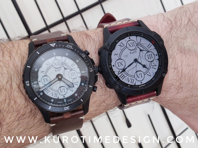 |
| A huge size difference for the display but not the watch |
- The fossil Hybrid HR uses a 1,1" 240x240 panel
- Fenix 6 has a 1,3" 260x260 display.
Compared with AMOLED screens, the pixel count is quite low and you will get sharper and more detailed graphics on an AMOLED watch.
COLOR
✌Winner : Fenix 6
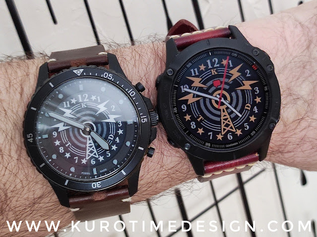 |
| Even only 64 colors is better than 4 grey levels |
- The Fossil Hybrid HR uses an e-ink panel. It can only display black, white and 2 levels of grey. It’s the same technology used in e-readers like Kobo and Kindle.
- The Garmin Fenix 6 features a MIP Reflective LCD (MIP is for Memory In Pixel) and can display 64 colors. It’s the same technology used in Pebble watches and GameBoy Color handheld consoles.
Both watches use dithering to create shades between colors.
The Fossil will attempt to display a middle grey by mixing dots of its dark grey and its light grey. Which often doesn’t look good and tend to reduce the clarity of the picture.
With 64 colors, the Fenix offers much more shades but cannot properly display colors in between those 64 shades and will use the same dithering trick to approximate other colors. However it’s less visible and looks much better than dithering on the Fossil’s more limited display.
CONTRAST & READABILITY
👉👈 Close match
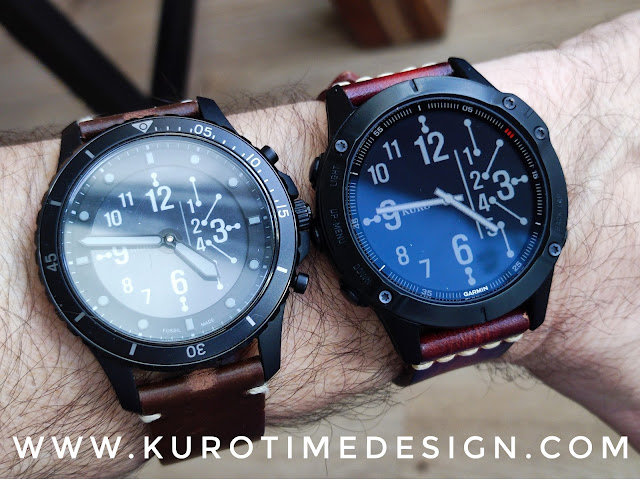 |
| Actual readability depends a lot of the anti glare, the contrast and the size |
That’s … complicated …
Because reflective LCD brightness will change a lot with the angle of the incoming light. The Fossil’s e-ink white background does a much better job to diffuse the incoming light evenly on all the surface. Reflective LCD is a bit like a mirror.
- Whites are much better on the Fossil, on the Fenix they tend to look grey with a metallic shade.
- Blacks are better on the Fenix, they tend to look grey and uneven on the Fossil.
- Contrast is better on the Fenix under good and strong light.
- Contrast is a tiny bit better on the Fossil under low light but it quickly becomes too dark to read anyway.
All of these differences tend to give IN THEORY a slightly better low light readability on the Fossil …
- but in dark places you will use the backlight anyway
- but fonts are much smaller on the Fossil
GLARE
✌Winner : Fenix 6
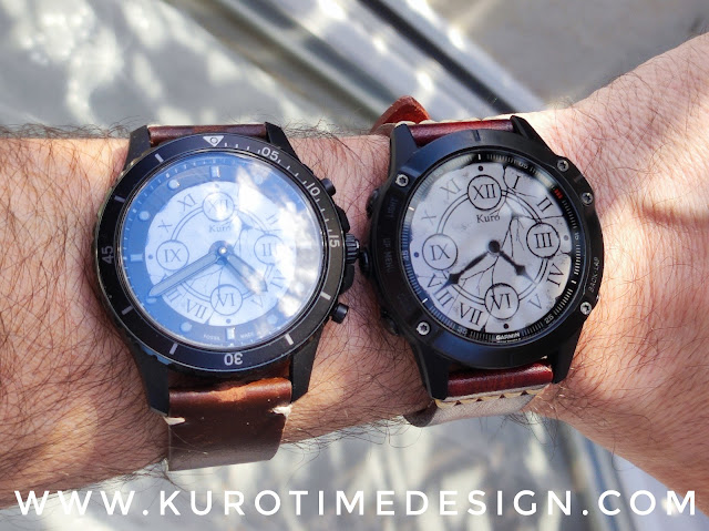 |
| Glare on the Fossil is sometimes extremely annoying |
- Fossil display is made of a glossy plastic and is located under the hands which are under a very glossy rounded glass. There is no anti reflective coating at all. The watch is incredibly prone to glare.
- Fenix 6 uses an anti reflective glass. It’s a lot better.
Don’t forget that glare will significantly reduce the readability of the display.
BACKLIGHT
✌Winner : Fenix 6
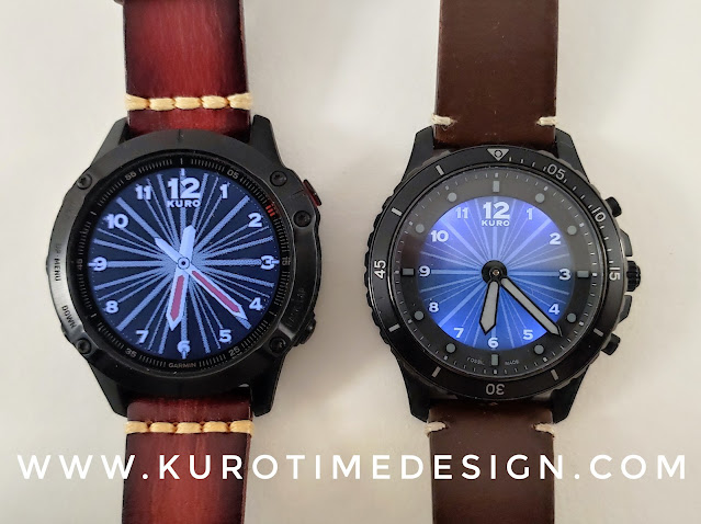 |
| Backlight on both watches |
- The Fossil Hybrid HR has 4 very blueish leds around the display. It produce a very uneven backlight which tend to wash out the contrasts and looks rather ugly. But frankly, you only use it for a very short time and I think that’s not a real issue. It gets the job done, allowing you to read your data and notifications by night. The real issue here is that there is no button to trigger the light, you have to double tap the watch case, which will trigger the accelerometer and then the light. Alas this is absolutely unreliable and you will quite often waste time punching on your watch like a fool.
- The Garmin has a much proper backlight. It is evenly distributed, less blueish (but still cold white) it does tend to wash out contrast too. You can set it to pop on automatically for notifications and when you interact with the watch. You can choose to keep it off by default and then only trigger the backlight with the DEDICATED LIGHT BUTTON (top left) which is the best option for me, because screen colors are much better without backlight. You also can ask the watch to automatically uses the light but only at given hours, by night for example.
There is no debate, the Fenix is much better there.
All IN ALL, DISPLAY IS MUCH BETTER ON THE FENIX 6
To put it in perspective, it seems usefull to consider that an AMOLED display would offer more contrast, more vibrant colors, more sharpness but would deplete the battery a lot quicker with always on display. However, it’s worth mentionning that AMOLED tech doesn’t like static images which tend to burn pixels. Despite all efforts made to mitigate the issue, it is not yet solved and an always on display on a watch will inevitably leave permanent marks after some monthes.
